Afedia: A Tribute Gallery
- Type
- Side project
- Role
- Design and build
- Year
- 2026
- Stack
- JavaScript, Tailwind, Vite, Vercel, HTML, CSS
- Live site
- Visit site
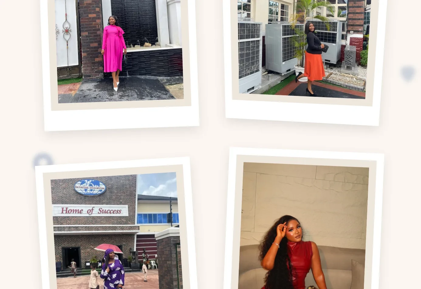
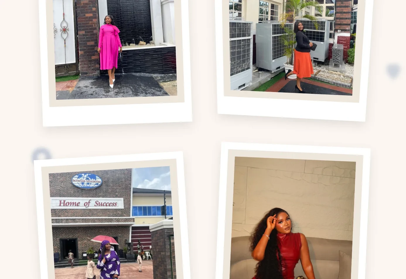
A quiet photo site I made for Glory: polaroid gallery, 3D hover tilt and a dark mode.
Why I made it
I built this for Glory, as a gift. There were things I wanted to say to her that words weren't enough for, so I made her a small corner of the internet: a quiet site of her photos, set the way you'd lay prints out on a table. She's seen it and she likes it, and she's happy for it to be shown here.
What I designed
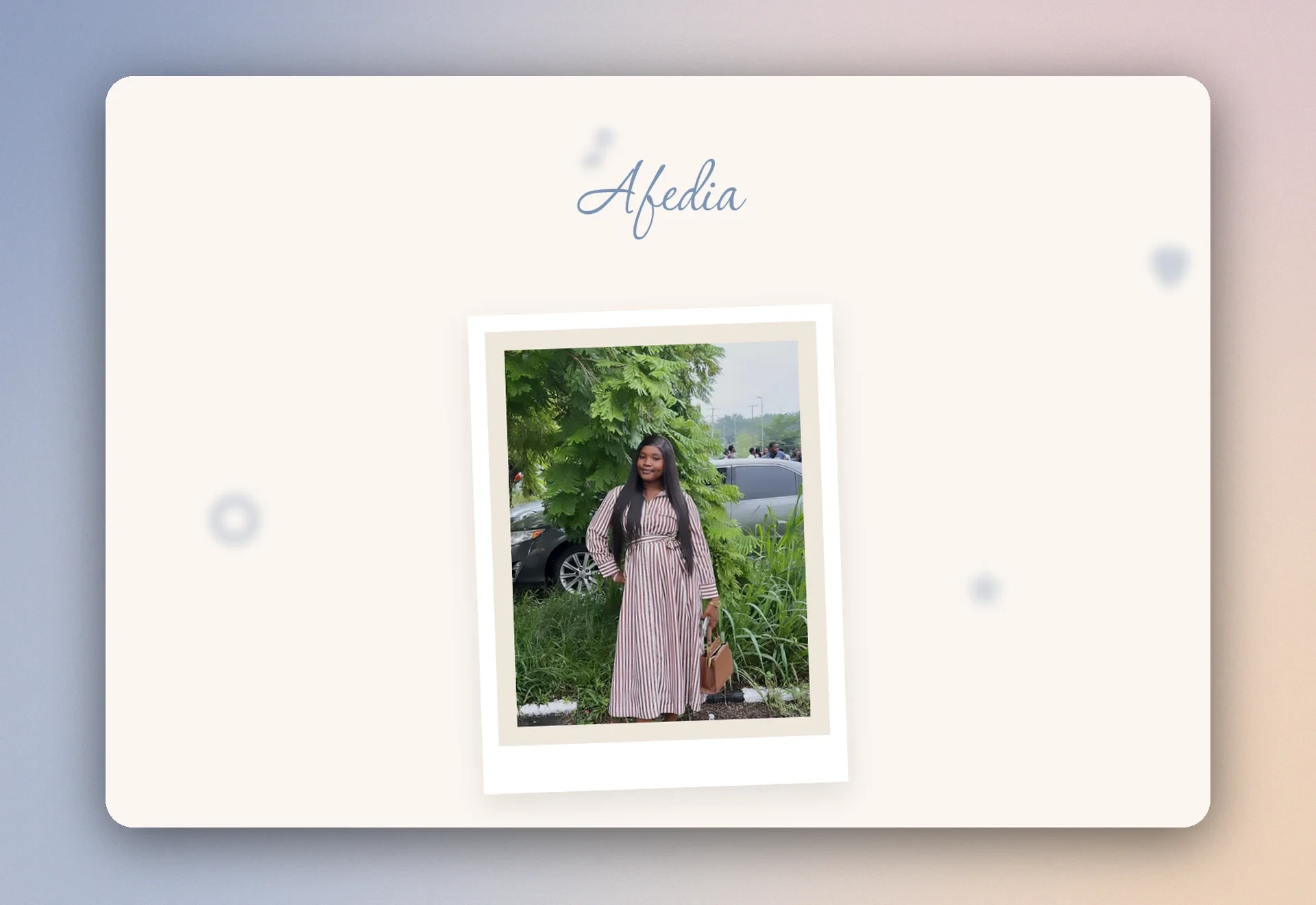
It's a single page with four parts: a hero with one framed photo of her, a two-line "a few words" section, a gallery of eight photos scattered like polaroids, and a footer with a "Connect" button that opens a small modal of her social links.
I designed the look and decided every detail of the interface and its behaviour. The page is soft rather than polished: a warm off-white ground, a handwritten script (Corinthia) for her name in a dusty blue, Inter for text, Fraunces for the gallery title, polaroid frames with slight tilts and shadows, and a two-column grid for the gallery that drops to one column on a phone.
How it was built
I worked with a coding agent. I designed the page first as standalone HTML mockups, then wrote a build brief that treated the mockups as the source of truth, and approved or rejected each pass: the first build, a refinement pass, a motion pass, dark mode, the background shapes, and a final polish. The result is a Vite and Tailwind v4 project with plain JavaScript. There's no framework and no gallery library, and the whole interactive layer is one file of about 120 lines.
Decisions I made
- Motion that stays quiet. Each polaroid fades in and settles into its own tilt as it scrolls into view, staggered by its position, using an
IntersectionObserver. Hovering tilts a photo in 3D, following the cursor, and it eases back when the cursor leaves. I asked for both to be short and subtle, with no bounce. - I turned one effect down. I prototyped an envelope-opening intro and dropped it, because I wasn't sure it would behave across screen sizes.
- Dark mode took three rounds. I first ruled it out, then added it as automatic only (a warm espresso background rather than cold black, with the polaroid frames staying paper-white), then added a manual toggle after I realised someone whose system defaults to dark would have no way to see the light version. The choice is saved in
localStorage. - No flash of the wrong theme. A tiny blocking script in
<head>reads the saved choice and sets the class before the first paint, so the page never flashes the wrong colours. The toggle's click handling lives inmain.js. - Two animations that had to share one property. The scroll-in and the hover tilt both animate
transform, and the slow entrance was making the hover feel sluggish afterwards. The fix was to set the long duration only for the entrance and clear it when the transition ends, and to read each photo's resting tilt from CSS custom properties so the hover starts from where the photo actually sits. - A bug in the background shapes. The soft blurred shapes drifting behind the page were blurring and swaying the entire page. The cause was a class-name collision: the shapes were called
.light, which is also the class I put on the page for the light theme. I renamed them and confirmed the fix in real Firefox.
Where it stands
It's live at afedia.vercel.app, and Glory has seen it.